be21b6aba013cadc0690d19ad3aefd399f74eb9c
### Issue
Fixes #140

### Description
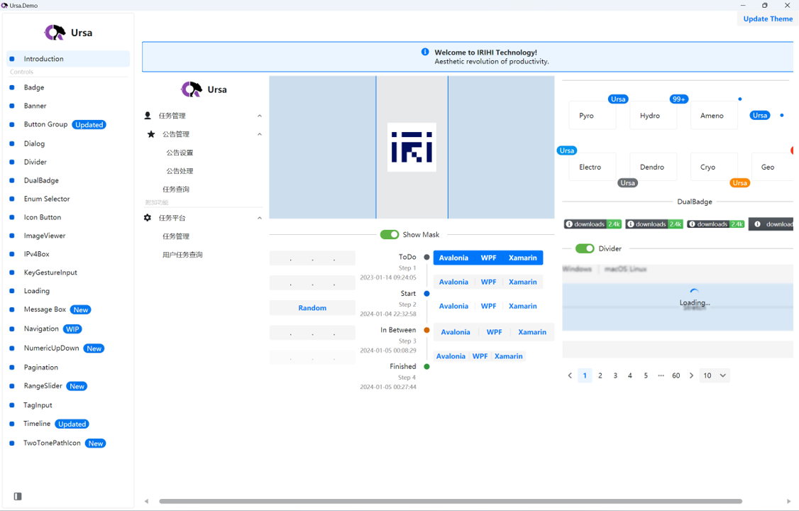
This PR addresses the issue where the ButtonGroup separator was invisible in dark mode by updating the ButtonGroupSeparatorForeground color to improve visibility. The opacity has been set to 0.08 with a white color to ensure the separator is visible in both light and dark modes.

### Changes Made
- Added SolidColorBrush with opacity 0.08 and color white for ButtonGroup separator
- Tested the changes in both light and dark modes to ensure improved visibility

### Additional Notes
- This fix should resolve the visibility issue in dark mode
- Please review and provide feedback
Ursa
Ursa is a UI library for building cross-platform UIs with Avalonia UI.
How to use
- Ursa
Add nuget package:
dotnet add package Irihi.Ursa --version 0.2.0-beta20240129
You can now use Ursa controls in your Avalonia Application.
<Window
    ...
    xmlns:u="https://irihi.tech/ursa"
    ...>
    <StackPanel Margin="20">
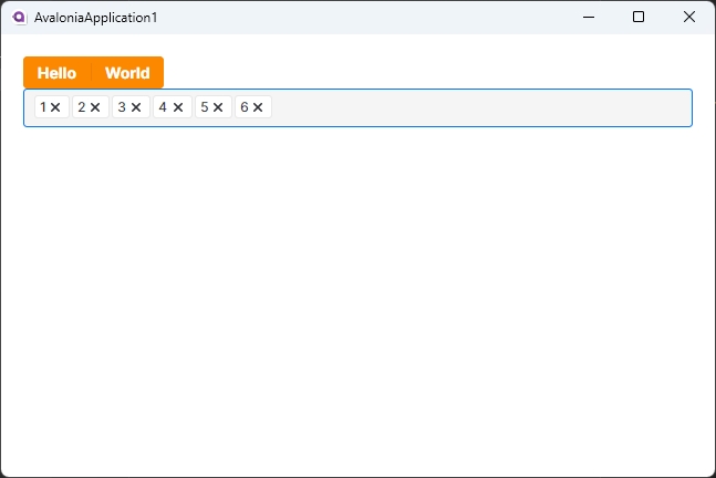
        <u:ButtonGroup Classes="Solid Warning">
            <Button Content="Hello" />
            <Button Content="World" />
        </u:ButtonGroup>
        <u:TagInput />
    </StackPanel>
</Window>
- Ursa.Themes.Semi
To make Ursa controls show up in your application, you need to reference to a theme package designed for Ursa. Ursa.Themes.Semi is a theme package for Ursa inspired by Semi Design. You can add it to your project by following steps.
Add nuget package:
dotnet add package Semi.Avalonia --version 11.0.7
dotnet add package Irihi.Ursa.Themes.Semi --version 0.2.0-beta20240129
Include Styles in application:
<Application...
    xmlns:u-semi="https://irihi.tech/ursa/themes/semi"
    ....>

    <Application.Styles>
        <StyleInclude Source="avares://Semi.Avalonia/Themes/Index.axaml" />
        <u-semi:SemiTheme Locale="zh-CN"/>
    </Application.Styles>
Languages
C#
100%


